Exploring UIStackView Distribution Types
Any time you encounter a new tool in your life, it’s a good idea to test it out to see what it can do. In this post, that’s what I’m going to do with UIStackViews. I’ll explore the different distribution types you can set on a UIStackView to see how they behave. That way, the next time I have a layout problem to solve, I’ll understand the UIStackView’s capabilities.
You can find the distribution setting on a UIStackView here.
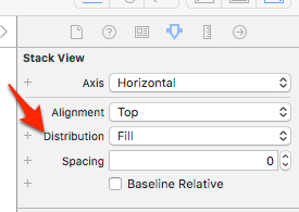
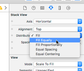
Fill
This is the default distribution type when you create a new UIStackView. In my test example for Fill, I am using UITextFields and UIImageViews and grouping them in a horizontal UIStackView. UITextFields do not have much of an intrinsic content size—they pretty much collapse down to nothing if you have no text inside them. This will help me demonstrate what effect the Fill type will have.
When you place your controls inside a UIStackView with Fill set as the distribution, it will keep all but one of the controls at their natural size and stretch one of them to fill the space. It determines which control to stretch by noting which one has the lowest Content Hugging Priority (CHP). I added a spacing of eight between the UITextFields so you could see the size of each one.
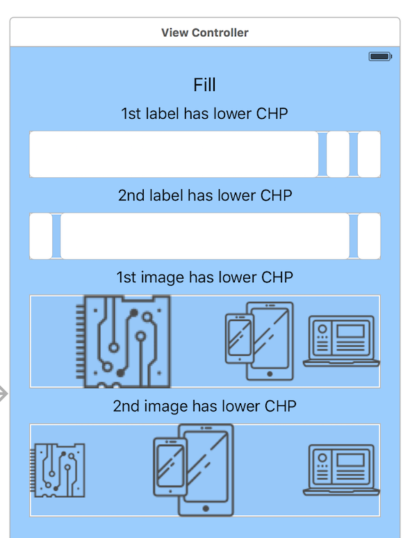
If all of your controls have the same CHP, then Xcode will complain that the layout is ambiguous.

If all of your controls have the same CHP, then Xcode will complain that the layout is ambiguous.
Fill Equally
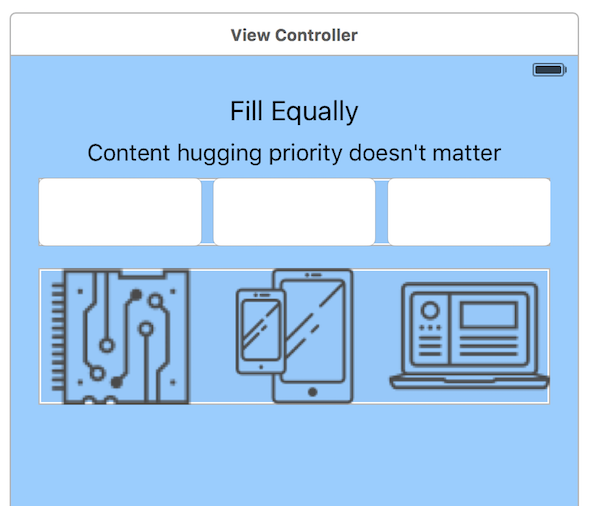
With this type, each control in a UIStackView will be of equal size. All of the space between the controls will be used up, if possible. I added a spacing of eight between the UITextFields, so again you could see the size of each one. With this type, the CHP does not matter, because each control is the same size.

Fill Proportionally
This type was fun to explore. It is hard to see the effect this type has until you play around with different phone sizes and orientations. The UIStackView will ensure the controls maintain the same proportion relative to one another as your layout grows and shrinks. I switched from using UITextFields to UILabels in my test.
Unlike the previous two settings, the Fill Proportionally distribution needs the controls to have an intrinsic content size. The Fill and Fill Equally distribution tell their child controls how big they should be, but this one is the other way around (as long as there is enough space for all of your controls to be their natural size).
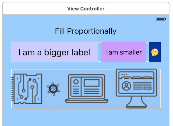
This is what the distribution looks like for portrait and landscape.
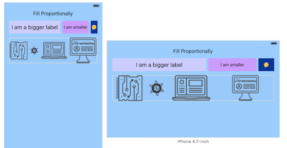
As you can see, the proportions for the images and labels are maintained for the different layout sizes.

This is what the distribution looks like for portrait and landscape.

As you can see, the proportions for the images and labels are maintained for the different layout sizes.
Equal Spacing
This distribution type will maintain an equal spacing between each of the controls and will not resize the controls themselves. I have illustrated this by drawing red lines to indicate the equal size of the spacing between the labels and the images.
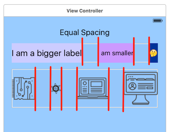

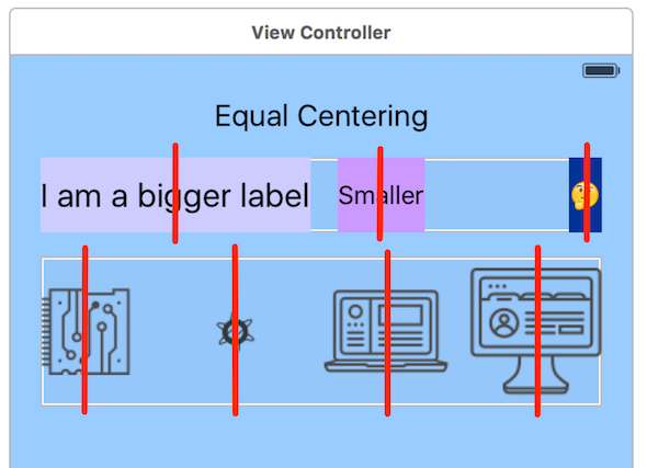
Equal Centering
Finally, the last distribution type is a little hard to see without an illustration. It will equally space the centers of the controls. To illustrate this, I drew red vertical lines down the center of each control. The distance between the red lines is spaced out equally.

Those are all of your options when using a UIStackView. They behave quite differently from one another. Some are opinionated about controlling the size of their children, and others let the children be as big as they want and try to space them out in different ways.
If you want to explore these types yourself, I have the project on GitHub.
Source: https://spin.atomicobject.com
Comments
Post a Comment